
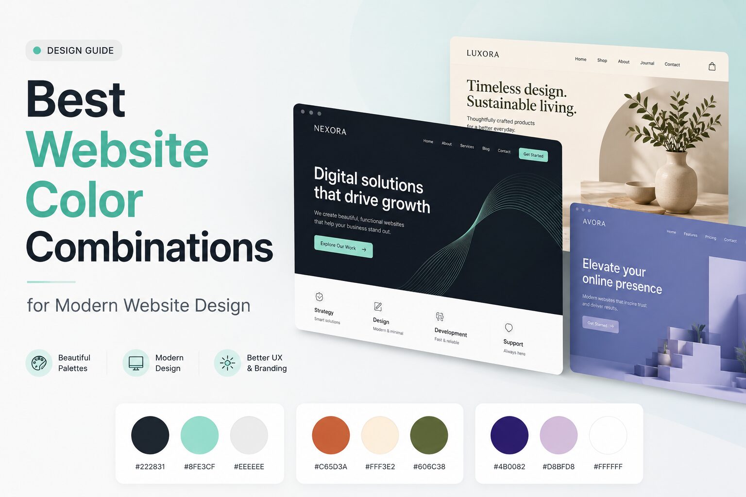
Your website colors speak before your headline does.
Before visitors read your offer, check your pricing, or click your menu, they already get a feeling from your design. A soft beige and sage palette feels calm. Navy and gold feels premium. Black and neon green feels bold and futuristic. The right website color combination can make your brand feel trustworthy, modern, friendly, luxurious, playful, or professional.
But choosing colors is not only about making a website look pretty. A strong color palette should also make your website easier to read, guide visitors toward important actions, support your brand personality, and work across desktop, mobile, light mode, and dark mode.
Color is one of the most influential visual tools in interface design because it can shape brand tone, direct attention, affect emotion, and improve usability when used well. Accessibility matters too: WCAG guidance recommends a contrast ratio of at least 4.5:1 for normal text and 3:1 for large text.
In this guide, you’ll find 25 website color combinations with HEX codes, design notes, best-use examples, and practical tips for applying each palette to a real website.
Quick Answer: What Is the Best Website Color Combination?
There is no single best website color combination for every brand. The best palette depends on your niche, audience, product, and brand personality.
That said, a strong website color scheme usually includes:
- – A dominant color for brand identity
- – A neutral background for readability
- – A high-contrast text color
- – One accent color for buttons, links, and calls-to-action
- – Enough contrast to keep the site accessible and easy to scan
A safe formula is:
60% background/neutral color + 30% brand color + 10% accent color
For example, a SaaS website might use soft white as the background, navy as the primary brand color, and electric blue or green for call-to-action buttons.
How to Choose a Website Color Combination
Before jumping into palettes, use this simple decision process.
1. Start With Your Brand Personality
Ask yourself: What should visitors feel when they land on the site?
For example:
| Brand Feeling | Good Color Direction |
|---|---|
| Trustworthy | Navy, blue, white, gray |
| Luxurious | Black, gold, cream, deep purple |
| Natural | Green, beige, brown, off-white |
| Creative | Purple, coral, orange, teal |
| Friendly | Sky blue, peach, yellow, mint |
| Modern | Charcoal, white, electric blue |
| Calm | Sage, beige, powder blue, warm white |
| Bold | Red, black, neon, deep blue |
2. Choose Color Roles, Not Just Colors
A website palette should have jobs. Do not just pick three colors because they look nice together.
Use this structure:
| Color Role | Purpose |
| Background | Main page background |
| Surface | Cards, boxes, forms, sections |
| Primary | Main brand color |
| Secondary | Supporting brand color |
| Accent | Buttons, links, highlights |
| Text | Body text and headings |
| Feedback | Success, warning, error states |
This makes the design more consistent and easier to apply across your homepage, blog posts, pricing pages, landing pages, and checkout pages.
3. Check Contrast Before Publishing
A beautiful palette can fail if visitors cannot read the text.
Use dark text on light backgrounds or light text on dark backgrounds. For normal body text, aim for at least a 4.5:1 contrast ratio. For large headings, 3:1 is the minimum accessibility benchmark.
Also, do not use color alone to communicate important information. WCAG’s use-of-color guidance says color should not be the only visual method used to indicate an action, response, or distinction. For example, if a form field has an error, use red color plus an icon or message.
10 Best Website Color Combinations With HEX Codes
1. Navy Blue, White, and Gold
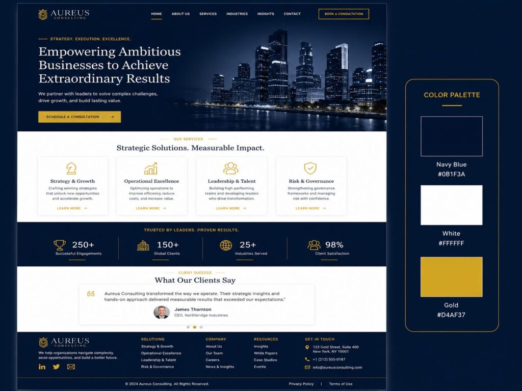
HEX Codes: #0B1F3A, #FFFFFF, #D4AF37
Vibe: Trustworthy, premium, established
Best For: Finance, consulting, law firms, real estate, business services
Navy blue is one of the safest choices for brands that need to build trust quickly. White keeps the layout clean, while gold adds a premium touch without making the design feel flashy.
How to Use It:
- – Use navy for the header, footer, and hero section
- – Use white for the main background
- – Use gold for CTA buttons, icons, badges, or pricing highlights
- – Keep typography clean and professional
Best CTA Color: Gold button with navy text or navy button with white text.
2. Charcoal, Mint, and Soft Gray
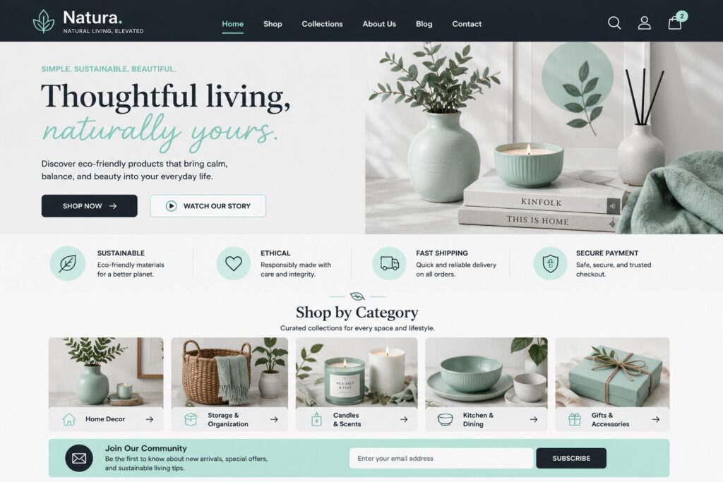
HEX Codes: #222831, #8FE3CF, #EEEEEE
Vibe: Clean, tech-friendly, calm
Best For: SaaS tools, startups, productivity apps, portfolios
Charcoal gives the site structure, mint adds freshness, and soft gray creates breathing space. This is a great palette for modern brands that want to look professional but not boring.
How to Use It:
- – Use charcoal for navigation and headings
- – Use soft gray for sections and cards
- – Use mint for CTAs, hover states, and icons
- – Add plenty of white space for a clean SaaS look
3. Deep Green, Cream, and Warm Beige
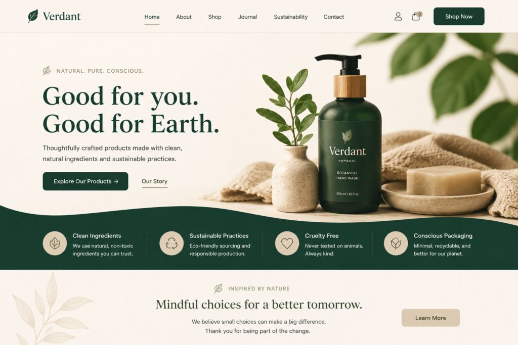
HEX Codes: #12372A, #FBF6EE, #D6C7AE
Vibe: Organic, calm, grounded
Best For: Wellness, skincare, eco brands, interior design, organic food
This palette feels natural and trustworthy. Deep green gives authority, cream keeps it soft, and beige makes the design feel warm and human.
How to Use It:
- – Use deep green for hero backgrounds and headings
- – Use cream as the page background
- – Use beige for cards, image frames, and secondary buttons
- – Pair it with elegant serif fonts or soft rounded sans-serif fonts
4. Black, White, and Electric Blue

HEX Codes: #050505, #FFFFFF, #007BFF
Vibe: Modern, sharp, high-contrast
Best For: Tech products, AI tools, developer platforms, digital agencies
This is a direct, high-impact color combination. Black and white create clarity, while electric blue makes interactive elements feel clickable and modern.
How to Use It:
- – Use black for hero sections or navigation
- – Use white for content-heavy areas
- – Use electric blue for buttons, links, and feature icons
- – Keep the layout minimal to avoid a harsh look
5. Soft Pink, Burgundy, and Ivory
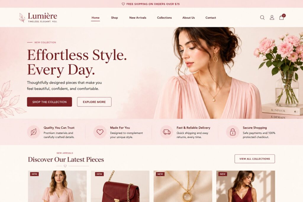
HEX Codes: #F8D7DA, #7B2D26, #FFF8F0
Vibe: Elegant, romantic, warm
Best For: Wedding websites, beauty brands, boutiques, lifestyle blogs
Soft pink adds approachability, burgundy gives depth, and ivory keeps the design sophisticated. It works especially well for brands that want a feminine but premium feel.
How to Use It:
- – Use ivory as the base background
- – Use burgundy for headings and navigation
- – Use soft pink for section backgrounds and highlight boxes
- – Use burgundy or rose-toned buttons for CTAs
6. Sky Blue, Coral, and White
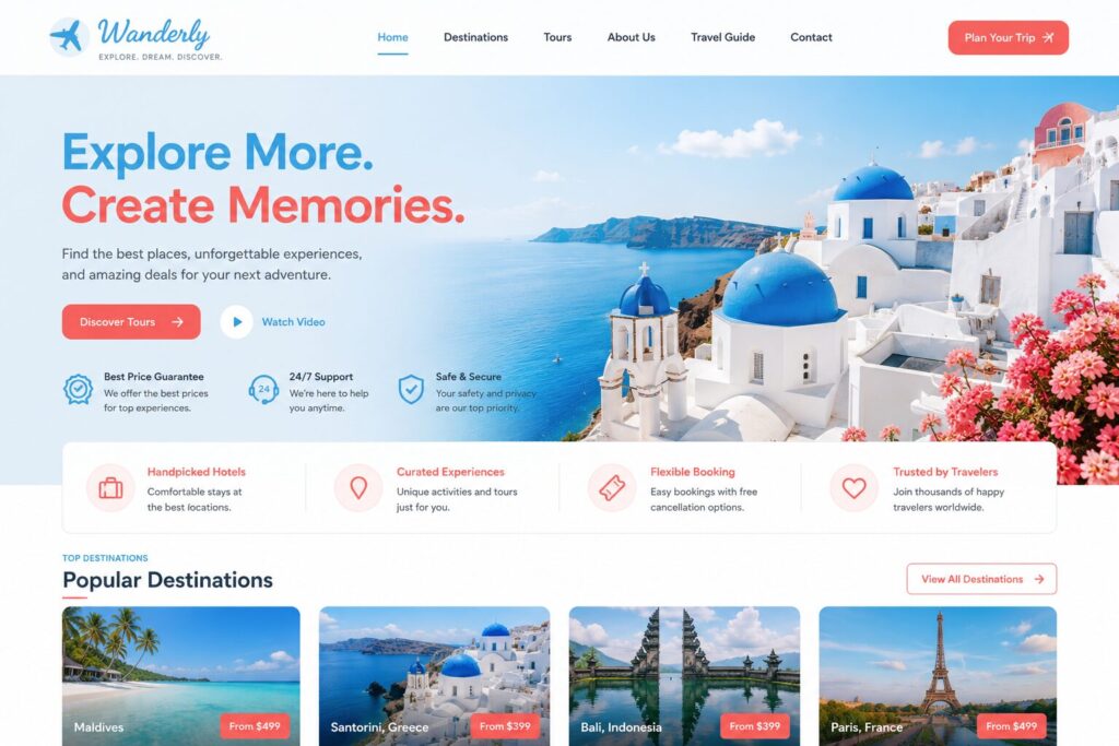
HEX Codes: #4DA8DA, #FF6B6B, #FFFFFF
Vibe: Friendly, energetic, optimistic
Best For: E-commerce, online courses, event websites, family brands
Sky blue feels open and trustworthy, while coral adds energy. White helps balance the brightness so the website does not feel overwhelming.
How to Use It:
- – Use sky blue for banners and hero backgrounds
- – Use coral for buttons, sale labels, and important highlights
- – Use white for product grids or course sections
- – Use dark navy or charcoal for text
7. Forest Green, Clay, and Off-White
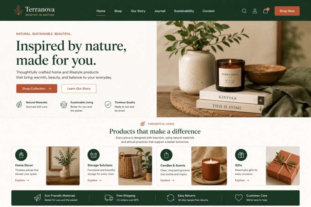
HEX Codes: #1B4332, #C97C5D, #FAF9F6
Vibe: Earthy, premium, natural
Best For: Home decor, gardening, restaurants, artisan shops
This combination feels warm, natural, and handcrafted. Forest green provides stability, clay adds personality, and off-white keeps the website polished.
How to Use It:
- – Use forest green for headers and brand blocks
- – Use clay for CTA buttons and section accents
- – Use off-white for the background
- – Use lifestyle photography with warm tones
8. Purple, Lavender, and White
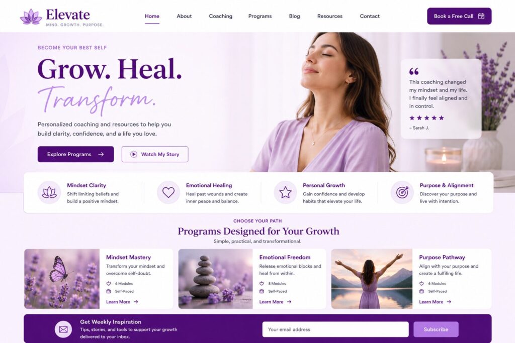
HEX Codes: #4B0082, #D8BFD8, #FFFFFF
Vibe: Creative, thoughtful, premium
Best For: Coaches, creators, beauty brands, spiritual websites, online communities
Purple often feels imaginative and premium. Lavender softens it, while white keeps the design clean and readable.
How to Use It:
- – Use deep purple for hero sections or headings
- – Use lavender for backgrounds, testimonials, and cards
- – Use white for content areas
- – Use purple buttons for primary CTAs
9. Slate Blue, Cyan, and Light Gray

HEX Codes: #2F3A56, #00C2CB, #F4F6F8
Vibe: Smart, modern, technical
Best For: Cybersecurity, analytics, finance tech, B2B software
Slate blue gives the design a serious professional base. Cyan adds a modern digital accent, while light gray makes dashboards and data sections easy to scan.
How to Use It:
- – Use slate blue for navigation and headings
- – Use cyan for charts, buttons, links, and icons
- – Use light gray for dashboard-style cards
- – Use white cards to separate complex information
10. Terracotta, Cream, and Olive
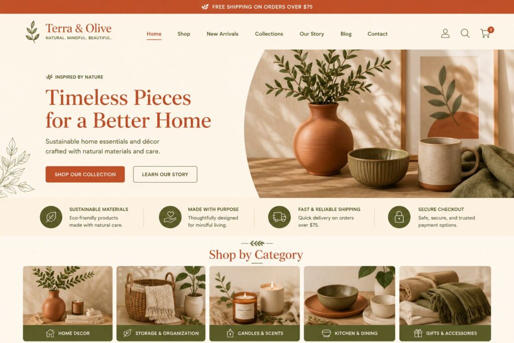
HEX Codes: #C65D3A, #FFF3E2, #606C38
Vibe: Warm, rustic, editorial
Best For: Food blogs, travel blogs, handmade products, home brands
Terracotta feels warm and expressive. Olive grounds the palette, while cream gives the website a comfortable editorial look.
How to Use It:
- – Use cream for the main background
- – Use terracotta for buttons and featured sections
- – Use olive for headings, navigation, and icons
- – Use warm photography to complete the look
Website Color Palette Comparison Table
| # | Palette | Best For | Style |
| 1 | Navy, White, Gold | Finance, law, consulting | Premium |
| 2 | Charcoal, Mint, Gray | SaaS, startups | Modern |
| 3 | Green, Cream, Beige | Wellness, eco brands | Natural |
| 4 | Black, White, Blue | AI, tech, agencies | Sharp |
| 5 | Pink, Burgundy, Ivory | Beauty, weddings | Elegant |
| 6 | Sky Blue, Coral, White | E-commerce, events | Friendly |
| 7 | Forest, Clay, Off-White | Home, food, artisan | Earthy |
| 8 | Purple, Lavender, White | Creators, coaches | Creative |
| 9 | Slate, Cyan, Gray | B2B, analytics | Technical |
| 10 | Terracotta, Cream, Olive | Food, travel, blogs | Warm |
Best Website Colors by Industry
Best Colors for Business Websites
Use navy, white, charcoal, gray, and gold. These colors feel stable, professional, and trustworthy.
Recommended Palette: Navy, White, Gold
HEX: #0B1F3A, #FFFFFF, #D4AF37
Best Colors for SaaS Websites
Use white, light gray, navy, cyan, mint, or electric blue. SaaS websites should feel clear, modern, and easy to use.
Recommended Palette: Slate Blue, Cyan, Light Gray
HEX: #2F3A56, #00C2CB, #F4F6F8
Best Colors for Health and Wellness Websites
Use sage, green, cream, beige, powder blue, and warm white. These colors feel calm and natural.
Recommended Palette: Sage Green, Warm White, Charcoal
HEX: #A3B18A, #FEFAE0, #2B2D2F
Best Colors for E-Commerce Websites
Use a clean neutral background with one strong accent color for buttons. Product photos should remain the focus.
Recommended Palette: Sky Blue, Coral, White
HEX: #4DA8DA, #FF6B6B, #FFFFFF
Best Colors for Luxury Websites
Use black, cream, champagne gold, deep purple, burgundy, or ivory. Keep the layout minimal and let the colors breathe.
Recommended Palette: Black, Cream, Champagne Gold
HEX: #0E0E0E, #FFF8E7, #C6A15B
Best Colors for Blogs
Use soft neutrals, charcoal text, and one memorable accent color. Blogs need readability first.
Recommended Palette: Mocha, Cream, Muted Blue
HEX: #6F4E37, #FFF4E6, #6B8EAE
How to Apply a Color Palette to Your Website
Here is a practical layout formula you can use.
Header
Use your primary brand color or a neutral background. Keep navigation readable.
Example:
- Background: Navy
- Text: White
- CTA: Gold
Hero Section
The hero section should create the strongest first impression. Use your main brand color here, but make sure your headline has strong contrast.
Example:
- Background: Deep green
- Heading: Cream
- Button: Clay or gold
Buttons
Use your accent color for primary buttons. Do not use the accent color everywhere, or the button will stop standing out.
Good button colors:
- – Orange on white
- – Gold on navy
- – Blue on white
- – Coral on pale blue
- – Lime on dark gray
Body Content
Use neutral backgrounds and dark readable text. Avoid using bright colors behind long paragraphs.
Good body combinations:
- – Charcoal text on white
- – Navy text on cream
- – Soft black text on warm white
- – White text on dark navy
Cards and Sections
Use a slightly different background color for cards so the page has visual structure.
Example:
- Page background:
#FFFFFF - Card background:
#F4F6F8 - Text:
#111827
Links
Links should be easy to recognize. Do not rely only on color inside paragraphs. Underlines, hover effects, or font-weight changes can help make links clearer, especially for accessibility. WCAG guidance warns against using color as the only way to convey meaning or distinguish an element.
Forms
Use clear borders, readable labels, and visible error messages.
Example:
- – Input background: White
- – Border: Light gray
- – Focus border: Blue
- – Error: Red plus message text
- – Success: Green plus confirmation text
Common Website Color Mistakes to Avoid
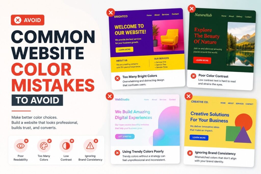
1. Using Too Many Colors
A website with six or seven competing colors often feels messy. Start with three core colors, then add functional colors for alerts and form states only when needed.
2. Low Contrast Text
Light gray text on a white background may look elegant in a mockup, but it can be hard to read. Always test your text and button contrast before publishing.
3. Making Every Button a Different Color
Your primary CTA should have one consistent color. If every button looks different, visitors may not know what action matters most.
4. Ignoring Mobile Screens
Colors can look different on phones, laptops, tablets, and monitors. Test your palette on real devices before finalizing it.
5. Using Red and Green Alone for Status
Do not show errors and success messages using only red and green. Some users may not distinguish those colors clearly. Add icons, labels, or explanatory text.
6. Following Trends Without Brand Fit
A trendy palette is not always the right palette. Choose colors that match your offer, audience, and long-term brand identity.
Dark Mode Color Tips
Dark mode is not just black backgrounds and white text. Pure black with pure white can feel harsh, especially for long reading sessions.
Use this instead:
| Element | Recommended Dark Mode Color |
| Background | #0F172A or #111827 |
| Surface/Card | #1F2937 |
| Main Text | #F9FAFB |
| Secondary Text | #D1D5DB |
| Border | #374151 |
| Accent | #38BDF8, #A78BFA, or #34D399 |
Dark mode works especially well for:
- – Developer tools
- – AI tools
- – Dashboards
- – Gaming websites
- – Creative portfolios
- – Premium product pages
Website Color Psychology Cheat Sheet
Color psychology is useful, but it should not be treated as a fixed rule. Meanings can change depending on culture, industry, context, and audience. Still, these associations are helpful starting points.
| Color | Common Feeling | Best Use |
| Blue | Trust, calm, stability | Finance, healthcare, tech |
| Green | Growth, nature, balance | Wellness, eco, food |
| Red | Urgency, passion, energy | Sales, sports, food |
| Yellow | Optimism, attention, warmth | Education, kids, creative |
| Orange | Confidence, fun, action | E-commerce, startups |
| Purple | Luxury, creativity, imagination | Beauty, coaching, creators |
| Pink | Softness, care, expression | Beauty, lifestyle, wellness |
| Black | Power, elegance, sophistication | Luxury, fashion, portfolios |
| White | Simplicity, clarity, openness | Minimal brands, modern websites |
| Gray | Neutrality, structure, professionalism | SaaS, B2B, portfolios |
| Brown | Warmth, comfort, craft | Coffee, food, handmade brands |
Simple Method to Build Your Own Website Color Palette
Use this five-step method if you want a custom palette.
Step 1: Pick One Brand Word
Choose one main word:
- – Premium
- – Friendly
- – Calm
- – Bold
- – Natural
- – Modern
- – Playful
- – Trustworthy
Step 2: Choose a Primary Color
Match the word to a color family.
Example:
- Trustworthy → Blue
- Natural → Green
- Luxury → Black or gold
- Creative → Purple or orange
Step 3: Add a Neutral
Pick white, cream, gray, charcoal, or black. This color will support readability.
Step 4: Add an Accent
Choose one accent color for buttons and highlights. It should stand out from the background.
Step 5: Test It in a Real Layout
Do not judge colors from a palette card alone. Test them on:
- – Homepage hero
- – Blog post
- – Pricing section
- – Contact form
- – Product cards
- – Mobile menu
- – CTA buttons
A palette that looks good in a square may not work on a full website.
Best Free Tools for Choosing Website Colors
Here are useful tools for testing and creating color palettes:
- WebAIM Contrast Checker for accessibility contrast testing
- Adobe Color for color harmony and palette inspiration
- Coolors for fast palette generation
- Realtime Colors for previewing colors on a website layout
- Figma for testing palettes in mockups
- Canva Color Palette Generator for extracting colors from images
Use these tools as helpers, not final decision-makers. Your brand, audience, and website goals should lead the design.
How AI Can Help You Choose Website Colors
AI website builders and design tools can speed up the color selection process by suggesting palettes based on your niche, business type, and brand description.
For example, instead of manually testing dozens of palettes, you can describe your website like this:
“Create a modern website for a premium skincare brand using calm, natural, elegant colors.”
An AI tool can then suggest matching colors, generate layouts, and show how those colors look in real sections like headers, CTAs, testimonials, and product cards.
AI is especially useful because color choices are easier to judge when you see them inside a real website layout rather than as isolated HEX codes.
Final Thoughts
The best website color combination is not just the one that looks beautiful. It is the one that supports your message, improves readability, guides attention, and makes your brand feel clear within seconds.
Start with your brand personality. Choose a primary color, a neutral background, and one strong accent color. Then test the palette on real website sections, especially buttons, text, forms, and mobile layouts.
If you are not sure where to begin, choose one of the palettes from this guide and customize it slightly to match your brand. A small change in shade, contrast, or button color can make a website feel completely unique.
Good color choices do not just decorate your website. They help visitors understand who you are, what you offer, and what to do next.
FAQs
What are the best color combinations for websites?
Some of the best website color combinations include navy, white, and gold; charcoal, mint, and gray; sage, warm white, and charcoal; black, cream, and gold; and sky blue, coral, and white. The best option depends on your brand personality and audience.
How many colors should a website have?
Most websites should start with three main colors: a primary brand color, a neutral background color, and an accent color. You can also add functional colors for success, warning, and error messages.
What color is best for website buttons?
The best button color is the one that contrasts clearly with the background. Orange, blue, green, red, gold, and coral can all work well if they stand out and fit the brand.
What is the best background color for a website?
White, off-white, cream, and very light gray are safe background choices for most websites because they keep content readable. Dark backgrounds can also work well for tech, luxury, gaming, and portfolio websites.
Are dark websites good for conversion?
Dark websites can work well when they match the brand and maintain strong readability. They are common for tech, AI, gaming, luxury, and creative websites. However, long-form content often needs careful contrast and spacing in dark mode.
What colors make a website look professional?
Navy, charcoal, white, gray, deep green, black, and muted blue can make a website look professional. For a premium feel, add gold, cream, burgundy, or champagne accents.
What colors should I avoid on a website?
Avoid low-contrast combinations, too many bright colors, neon text on light backgrounds, and color pairings that make reading difficult. Also avoid using color alone to communicate important information such as errors or success messages.
How do I know if my website colors are accessible?
Check the contrast between your text and background. For normal text, aim for at least 4.5:1 contrast. For large text, aim for at least 3:1. Also make sure important information is not communicated by color alone.
Can I use AI to choose website colors?
Yes. AI tools can suggest color palettes based on your niche, brand tone, and audience. They can also preview colors inside real website layouts, making it easier to decide what looks best before publishing.
What is the safest website color palette for beginners?
A safe beginner palette is white, charcoal, and one accent color such as blue, green, coral, or gold. This keeps the website readable, clean, and easy to design.