Building a website for a healthcare practice has always carried a specific kind of pressure. It’s not just about looking professional — it’s about earning trust instantly. Patients arriving at a clinic’s website are often already anxious. A clunky layout, an outdated design, or a template that feels lifted from a generic business site can undercut confidence before a single appointment is booked.
The traditional options haven’t made this easy. Off-the-shelf medical templates tend to look alike — sterile blues, stock imagery of smiling nurses, the same three-column layout everyone else is using. Custom design work takes weeks and a budget that smaller practices often can’t justify.
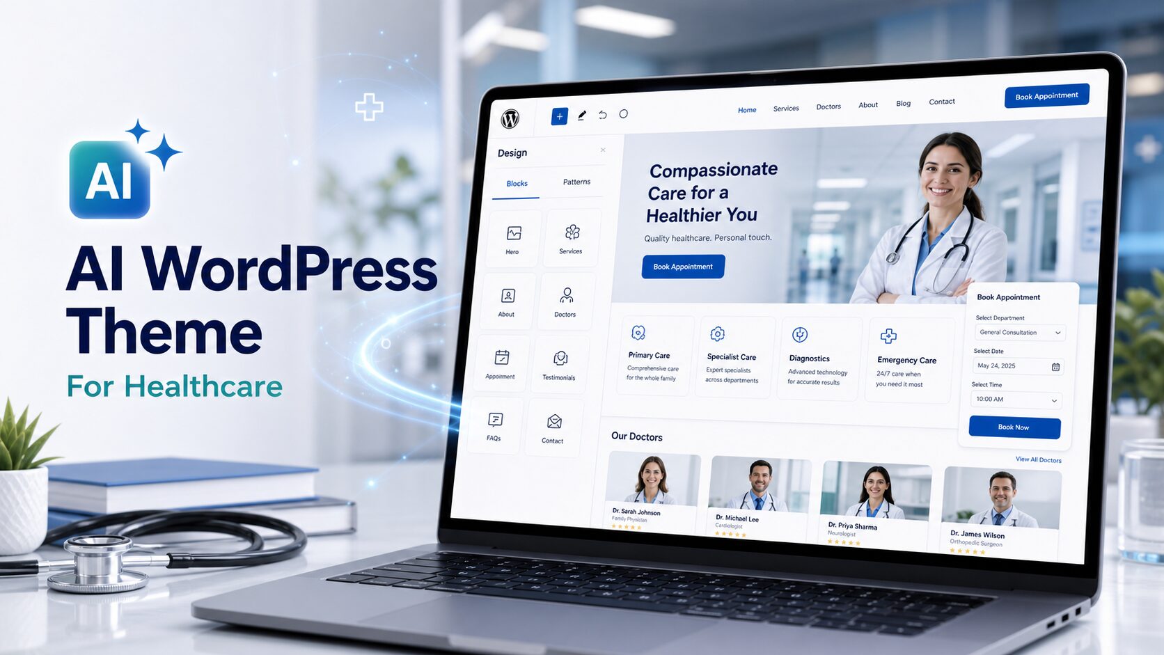
AI website generation offers a different starting point. Describe your practice — its specialty, its tone, whether you want to project warmth or clinical authority, who your patients are — and you can have a complete, ready-to-edit WordPress theme in minutes that actually reflects what you do. In this article, we’ll walk through three real healthcare themes generated with PressMeGPT — Hunter Clinical Services, Opus, and Foot Health Foundation Editorial — to show how different healthcare briefs produce genuinely different results.
Why Healthcare Is a Particularly Good Use Case for AI-Generated Themes
Healthcare websites follow a recognizable structure: a trust-building hero section, a services overview, a team or credentials section, patient resources or FAQs, and a clear path to booking or contacting the practice. That predictable architecture is where AI generation works well. The differentiation comes from tone and positioning — a pediatric clinic, a psychiatric practice, a surgical center, and a community health foundation all need structurally similar pages, but the visual language and content hierarchy should feel completely different.
When you describe your specialty, your patient demographic, and the emotional register you want to hit — clinical precision versus approachable warmth versus editorial authority — the output reflects those choices in layout and design, not just color swaps on the same template.
Example 1: Hunter Clinical Services — Structured, Institutional Trust
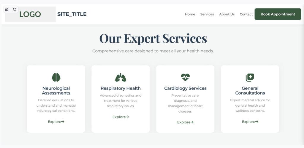
Hunter Clinical Services is a theme built for a clinical environment that needs to project institutional credibility. The design is structured and confident — clear section hierarchy, professional typography, and a layout that moves visitors logically from “what we offer” to “why trust us” to “how to get in touch.” Nothing is decorative for its own sake. Every section earns its place by serving a specific trust signal.
This approach works well for multi-practitioner clinics, allied health services, and any practice where patients are making considered decisions about specialist care. The visual language communicates that this is an organized, professional environment — the kind of place where records are kept properly, where staff know what they’re doing, and where the patient experience has been thought through. It doesn’t try to be warm or lifestyle-oriented; it tries to be reliable, and it succeeds at that.
Example 2: Opus — Premium, Minimal, Specialist Positioning
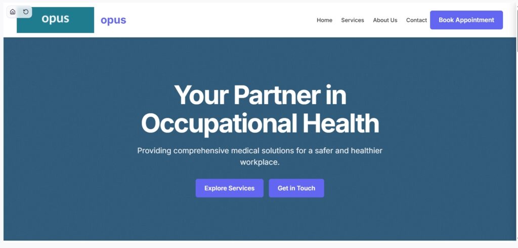
Opus takes a fundamentally different approach. Where Hunter Clinical Services builds trust through structure and completeness, Opus builds it through restraint. The design is minimal — generous whitespace, a precise typographic palette, and a layout that lets the practice’s credentials and specialty speak without visual noise competing for attention.
This is the right register for high-end specialist practices: consultants, surgeons, private clinics, and any healthcare provider whose patients expect the same level of polish from a website that they expect from the care itself. In premium healthcare, visual clutter is a trust problem. Opus avoids it entirely. The result feels closer to a well-designed private medical center than a community health hub — which, for the right practice, is exactly the signal worth sending.
Comparing Opus to Hunter Clinical Services is instructive. Both are professional healthcare themes. But Opus is clearly speaking to a different patient — one who is paying privately, choosing between specialist providers, and reading design cues as signals of quality. The brief shaped that difference, not just a color picker.
Example 3: Foot Health Foundation Editorial — Specialist Depth with an Educational Voice
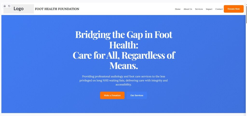
Foot Health Foundation Editorial is the most distinctive of the three, and the most specific in its purpose. Rather than a general clinical or practice layout, this theme is built around editorial content — articles, guides, patient education, and condition-specific information — anchored by the specialist focus of podiatry and foot health.
The design reflects that priority. It reads more like a well-produced health publication than a standard clinic site, with a content-forward layout that makes room for depth. This works because foot health as a specialty lives at an interesting intersection: patients often arrive having already done research, looking for a practice they trust has genuine expertise, not just availability. An editorial theme that demonstrates knowledge — through blog posts, condition guides, treatment explanations — is a smarter trust-builder for this kind of practice than a straight service-listing layout.
This theme also demonstrates something important about AI generation: specificity of brief produces specificity of output. “A healthcare website” would produce a generic result. “A podiatry foundation with an editorial, education-first approach” produces something like Foot Health Foundation Editorial — a layout actually designed around how that practice earns patient trust.
How the Process Actually Works, Step by Step
Step 1: Describe your practice in specific terms
The most important input is your specialty and your tone. A general practice, a mental health clinic, a surgical center, and a physiotherapy studio all need different things from a website — not just different colors, but different content hierarchy and different emotional registers. Describe who your patients are, what decisions they’re making when they visit your site, and how you want them to feel: reassured, informed, confident in your expertise, or welcomed into a relationship of ongoing care. The three themes above came from three distinct briefs, and the outputs reflect that.
Step 2: Review the generated variations
The generator produces multiple design directions from your description. Reviewing them side by side — as the contrast between Hunter Clinical Services, Opus, and Foot Health Foundation makes clear — lets you see structural and tonal differences rather than just color differences. This is where you decide whether your site needs to project institutional authority, premium restraint, or editorial depth.
Step 3: Refine with natural language or built-in controls
Once you have a direction, adjustments are simple. Add an online booking section, adjust the services layout, swap placeholder photography for real imagery of your clinic or team, or change the typographic weight to feel warmer or more formal. These refinements can be made using built-in controls or described in plain language.
Step 4: Build out your full page set
Healthcare sites typically need more than a homepage — individual service pages, a team and credentials page, a patient resources or FAQ section, a blog or news section for health content, and a contact/booking page. Each can be generated individually, tailored to its function rather than duplicating the homepage structure.
Step 5: Export to WordPress
The finished theme exports as a standard WordPress theme — Gutenberg, Classic, or Elementor — so it runs on familiar hosting infrastructure. Appointment integrations, patient portal links, and future content updates all happen on a platform your practice controls, with no lock-in to a closed builder.
What This Means for Healthcare Providers Building a Site
The practical case is straightforward: speed, specificity, and ownership. Speed because a real, structured starting point is ready in minutes rather than weeks. Specificity because the output reflects your specialty and positioning, not a generic medical template you have to fight into shape. Ownership because the result is a real WordPress theme — your practice’s content, credentials, and patient communications happen on infrastructure you control.
For anyone weighing whether AI-generated healthcare themes can actually look meaningfully different from one another, Hunter Clinical Services, Opus, and Foot Health Foundation Editorial are a concrete answer: three different practices, three different patient relationships, three different design outcomes — all from how the brief was written.
You can explore more healthcare and clinical examples in the PressMeGPT theme directory or start describing your practice directly to generate your first version.